Developer Blog

28/05/2020 by Bryan Hennessy

CAN Signal Analysis with Spreadsheets and Kvaser’s CanKing SAE J1939 Example

A few of the customers I’ve worked with over the last few years have indicated a need to analyze a limited number of CAN signals within an SAE J1939 data stream. Although Kvaser has many partner companies that offer plenty of powerful choices for CAN analysis software, it is sometimes desirable to graph a signal with the tools we have. For a student with a one-time need, or an engineer from a small company who just wants to understand a signal on a CAN bus, this method would have value. 

In this paper I will present a method to capture and analyze a CAN signal, buried within a CAN frame, using Microsoft Excel, Notepad, and Kvaser’s free CanKing software. These are tools most of us already have, or in the case of CanKing, can download free from the Kvaser website.

By using this method to initially analyze a signal, an engineer will gain additional insight into the inner workings of CAN and J1939, as well as an understanding of the .dbc file and how it is used by other applications. Although I use a J1939 signal as an example in this paper, the method I am using is applicable to any signal-based CAN protocol including CANOpen, RVC, NMEA 2000®, and many more. While the method shown uses Excel and Notepad, there are other Spreadsheet and Text Editor programs that will accomplish the same thing.

The intention of this paper is not to detract from the many very powerful CAN analysis tools already available to customers through our partner network. Many of these tools have built in support of high-level protocols like J1939 and CANOpen, with powerful graphical and signal analysis capabilities that include the ability to analyze high data volumes (‘big data’). The method presented here will show that with a few simple tools and a need for limited analysis, an engineer may be able to get what they want with the tools they already have on their desktop.

This method also has limitations well beyond those of the dedicated software sold by Kvaser partners. These limitations prevent, or at least greatly complicate, signal analysis in the case of variable length Diagnostic Messages (DMs), Transport Protocol Frames, and multiplexed data frames. In any of these cases a dedicated CAN analysis package will be required, or at least highly desired, in order to properly analyze signals within the data stream. 

Prerequisites for this method:

  • Be capable of capturing raw CAN data in Hexadecimal (‘hex’) or Decimal format, or have access to the raw CAN data you want to analyze, and be able to transfer that data into a .txt file. This will be shown using Kvaser’s CanKing software, free and available at https://www.kvaser.com/download/.
  • Access to Microsoft Excel or equivalent, with a basic understanding of how to use the Filters function within your spread sheet software.
  • Know what data you want to see, or have a .dbc file or a specification showing where to find the signal you’re looking for within the CAN frame, and know how that signal is formatted within the message

The steps we will follow are:

  1. Capture the data with CanKing, and save it to a text file with Notepad
  2. Open Excel and import the data from the text file
  3. Format the data to be in separate columns
  4. Filter the data to find the CAN frames of interest
  5. Isolate the data bytes to be analyzed
  6. Convert the data to a graphable format
  7. Create a graph showing the signal of interest

1. Capture and save data with CanKing

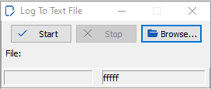
If Kvaser’s CanKing is not already loaded and working on your computer, download it and the Kvaser Drivers for Windows, both found in the Downloads section of www.kvaser.com. You can use any Kvaser interface such as the Kvaser Leaf Light HS v2, a Kvaser USBcan, or a Kvaser Memorator to capture data for analysis. There are many ways you can do this from CanKing. If you are capturing J1939 data you should go to the Select Formatter window and select the J1939 Formatter, by putting this formatter in the Active Formatters section of the window and checking the box next to it.  This will allow your data to be formatted as in Figure 2. Once you have connected to your CAN bus and can see the data, you can use the Log To Text File window to start and stop logging, then save the file to your projects working directory.

Picture1

Figure 1. Log to Text File, a Window within Kvaser CanKing

Figure 1 shows Kvaser CanKing’s Log To Text File window that will allow the user to capture the CAN data that is to be analyzed. Confirm that you are connected to the CAN bus and seeing the data in CanKing by selecting the Start Run button in the Kvaser CanKing main window. The data that is going to be captured is what you see in the Output Window of CanKing.

The data will look something like this, when viewed with a text editor like NotePad:

WinNo P   PGN SA  DA Flg   Len  D0...1...2...3...4...5...6..D7      Time   Dir
CAN 1 6 0F009 0B->*         8   7D  7A  60  83  7D  4F  7D  7D     217.088350 R

CAN 1 3 0F004 00->*         8   60  7D  84  50  14  00  F0  84     217.093810 R

CAN 1 6 0F009 0B->*         8   7D  7A  60  83  7D  4F  7D  7D     217.097340 R

CAN 1 3 0F004 00->*         8   60  7D  84  50  14  00  F0  84     217.104820 R

CAN 1 6 0F009 0B->*         8   7D  7A  60  83  7D  4F  7D  7D     217.107600 R

CAN 1 6 0FEF1 31->*         8   F7  FF  FF  CF  FF  FF  FF  FF     217.111110 R

CAN 1 7 0FF05 8A->*         8   00  FF  FF  FF  FF  FF  FF  FF     217.113450 R

CAN 1 3 0F004 00->*         8   60  7D  84  54  14  00  F0  84     217.114870 R

CAN 1 6 0FEE0 27->*         8   FF  FF  FF  FF  AC  A8  06  00     217.115440 R

CAN 1 7 0FEC3 27->*         8   FF  FC  FF  FF  FF  FF  FF  FF     217.116020 R

CAN 1 6 0FF6F 8A->*         8   E2  14  E0  15  A0  12  FF  5E     217.116570 R

CAN 1 6 0F009 0B->*         8   7D  7A  60  83  7D  47  7D  7D     217.117580 R

CAN 1 3 0F004 00->*         8   60  7D  84  54  14  00  F0  84     217.126930 R

CAN 1 6 0F009 0B->*         8   7D  7A  60  83  7D  47  7D  7D     217.127770 R

CAN 1 6 0FF60 4D->*         8   00  00  00  FF  FF  FF  FF  FF     217.131710 R

Figure 2. Sample J1939 data captured with CanKing

In this simple case, all the CAN frames have eight data bytes. The signal I’m going to analyze is a periodic signal of 10 msec, and I’ll graph a few seconds worth of data. At this point you should have the data stream you want to analyze in a .txt file in a working directory on your computer.


2. Open Excel and Import the data

The goal of this step is to get your data into Excel so we can manipulate it with the Filter functions and isolate the data we want to analyze. Other spread sheet programs will also work if they have filters, functions, and graphing capabilities, similar to Excel. It is up to the reader to determine if using a different application is best for them, and find similar functions that will accomplish the conversions.

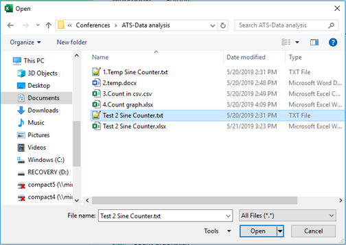
Open Microsoft Excel with a blank worksheet and select File, Open and Browse. In the lower right hand corner of your navigation box you’ll have to select All Files (*.*) so that your .txt file can be opened. Navigate to your working directory and find and select the .txt file you created in step 1 above. Your display will look something like this:

Picture2

Figure 3. Selecting a .txt file to open within Excel

Select the .txt file you created in step 1 and open it.


3. Format the data to be in separate columns:

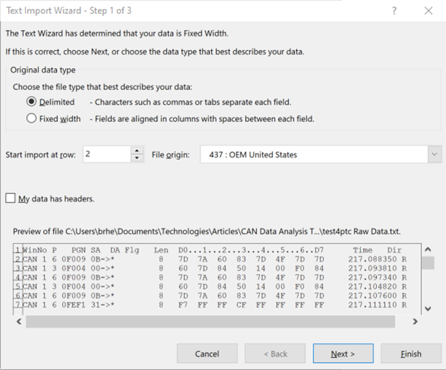
Once you have selected your .txt file and attempted to open it with Excel, you will see the Text Import Wizard as shown in Figure 4.  There are different ways you can import your CAN data into Excel using the Text Import Wizard, and many of them will work to some extent.  One way or the other you will most likely have to edit your data and/or headers to make it graph properly.  

Picture3

Figure 4. The Text Import Wizard

This Wizard gives you a quick and easy way to convert your .txt data into Excel format. Follow these steps to convert your data:

  1. Under Choose the file type that best describes your data: select Delimited.
  2. Next to Start import at row: select the first row that has your CAN data; in my case it’s the second row. Some data monitors put in headers and you just want to filter those headers out. You can add them back in later with Excel.
  3. Press Next >.
  4. In the second window under Delimiters select Space.
  5. Press Next >.
  6. Press Finish.

You should now have an Excel Worksheet open that shows your CAN frames separated in columns for Identifier, Flag, DLC and data bytes. You will also have columns for Time and Direction. If you kept your column headers above your data, make sure the headers are lined up correctly with the data. Sometimes the headers get shifted by one or two columns in the conversion process. If you didn’t keep your column headers above your data, you should add them back in now.  The column names I used are Type, Ch, Pri, PGN, SA/DA, DLC, D1, D2, D3, D4, D5, D6, D7, D8, Time, and Dir. Here is what the first few lines of my spread sheet look like after I added the column headers:

Figure 5. My spreadsheet so far.

My data consist of only eight-byte frames, so everything lines up nicely under the headers I entered on the first row. If your data has some frames with different DLCs things will not line up as nicely for you. Don’t worry about this, because you’re going to be graphing one PGN at a time, and at this level a given PGN has a fixed DLC, almost always eight bytes.


4. Filter the data to find the CAN frames of interest

This is where you need to know what data you’re looking for and where this data is located within the CAN frame. In J1939 as well as other CAN based protocols, the Data portion of the CAN frame is usually used to communicate more than one signal. Different protocols use different names for things like massages and signals. I’m going to use J1939 terminology when possible, and try to keep it consistent. In J1939 talk, a signal is an informal way to refer to an SP, or a Suspect Parameter. To identify a signal, you use a Suspect Parameter Number, or SPN.  A group of signals make up a Parameter Group, or PG, and a PG is identified by a Parameter Group Number, or PGN.  For the example we’re going to use, a PG is going to fit into one CAN frame.  This is not always the case, sometimes a PG is spread across multiple CAN frames by using Transport Protocol, but that’s a subject for a later write-up.

In my example we’re going to analyze a signal called Engine Speed. Details of this signal can be found in the SAE J1939DA, or Digital Annex. Engine Speed is identified as SPN 190 and some of the details from the Digital Annex are shown below:

Picture5

Table 1. Information obtained from the SAE J1939DA specification

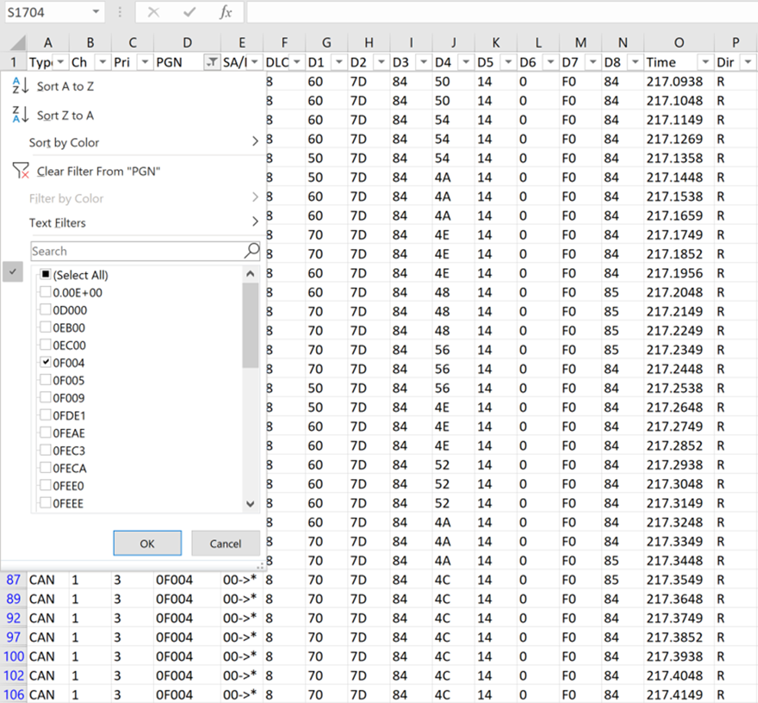
Table 1 gives us everything we need to know to graph Engine Speed from the data we have collected, but first we must be able to filter the data to find only what we are interested in.  The key here is the PGN, 61444.  This is represented as a decimal number so converting to hexadecimal gives us 0x0F004. This is the PGN we want to isolate so we can graph SPN 190, because this is the PGN that contains SPN 190. The format is in hexadecimal just as it is shown in Figure 6 column D. Figure 6 also shows that I have turned on the Filter function. I can now Filter column D for the data I want to graph.

Picture4

Figure 6. Excel Spread Sheet with filtering turned on, showing all data

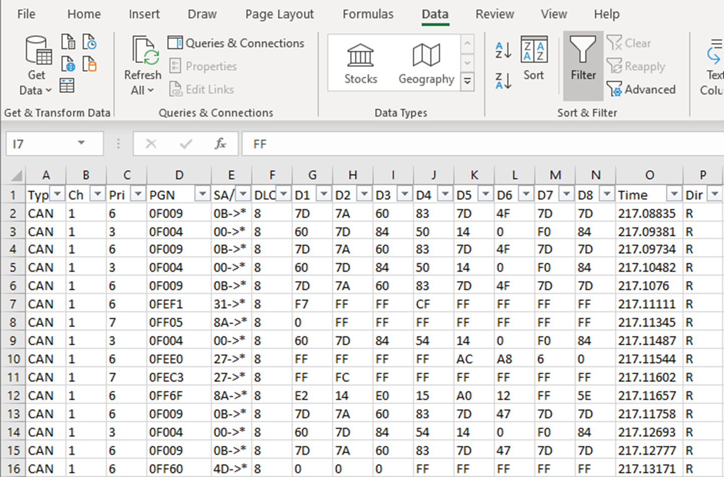
If you have not previously used the Filters within Excel, click on the Data tap at the top in Excel, and find Filter. Highlight the top row of the data (the headers row) then turn the Filter function on and you will see small boxes in each column of the top row of your spread sheet with down arrows in them.  Select the arrow over the column PGN and you should see a box come down as in Figure 7.

Uncheck the (Select All) box, and then select just the message you want to filter on, in this case 0F004.  Select OK and you will have filtered on the data you want to see. Your spread sheet will now be showing only the CAN frames containing the message with the signal we want to graph, SPN 190, Engine Speed.

Picture5

Figure 7. Excel Spread Sheet with filtering turned on, showing only Engine Speed PGN


5. Isolate the data bytes to be analyzed

Our spread sheet is showing only the CAN frames containing the data we want to graph, so now it’s time to isolate the signal we want.

Picture6

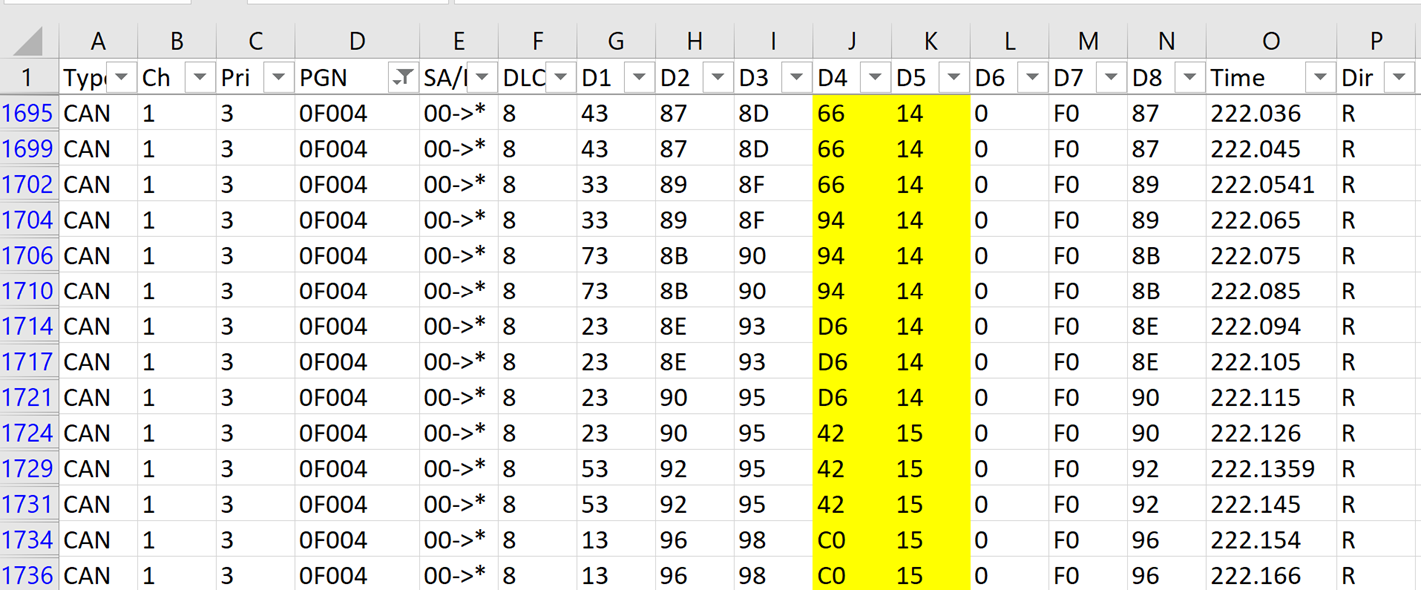
Figure 8.

Going back to Table 1, we can see that Engine Speed is a two-byte signal contained in position 4 and 5, or according to our headers, D4 and D5. Since this is a two-byte signal we must consider byte order before we do any calculations on the data. Figure 8 shows a cut from our filtered data with D4 and D5 highlighted in Yellow. Just by looking at the data it’s easy to answer the question about byte order. We can see that the least significant byte is in D4 and is transmitted first. We know this because it’s the byte that’s changing the most, and we can see it’s driving D5 up by one when it rolls over.

If we look at the first line of data in Figure 8, and look at Engine Speed as a single number, we can write the hexadecimal value of Engine Speed as 0x1466. We have now isolated SPN 190 within the data that was captured from the CAN bus. It is isolated to D4 and D5 in PGN 0x0F004, or PGN 61444.

Some SPNs are less than one byte, and in some cases, they’re combined with other SPNs in the same byte. If this were the case for the SPN we were interested in, it would require some more Excel functions like masking and shifting. Spreadsheets offer many mathematical functions that can be applied to the data in many creative ways. It’s up to the reader to find a way to use those functions to isolate whatever specific data they’re interested in graphing.


6. Convert the data to a graphable format

The only other things we must consider for this signal before graphing it is the resolution and the offset. Resolution is the term used in the SAE J1939DA, to describe the scaling factor to be applied to a signal so that it is displayed in an understandable and readable way. If you are using

the Kvaser Database Editor 3 software, also free and downloadable from kvaser.com/download/ to extract this information from a .dbc file, the term that is used is Factor. Table 1 shows the resolution equal to 0.125 rpm per bit, and the offset equal to zero. Follow the steps below to calculate Engine Speed in RPMs, from the raw data that is transmitted:

  1. Convert the two-byte SPN 190 to a decimal number, ex. 0x1466 = 5,222.
  2. Multiply this number by the resolution, or what I call scaling: (5,222 bits) x (0.125 rpm/bit) = 652.75 rpm
  3. Apply the offset, in this case zero, so the final value is 652.75 rpm

With the power of the spreads sheet we can easily make this calculation for all the samples of the signal we want to graph.  The first thing to do is to add a blank column to the right of the column D5. Once this column is in, we can use it to calculate RPMs with the steps above. If this is not clear you should review the Functions capabilities within Excel by going to a blank cell and typing “=”, then clicking on fx up by the menu bar. My data is in columns J and K, so here is the function I am going to enter into the first block of my new column under the header row:

=HEX2DEC(CONCAT(K3,J3))*0.125

This single line will concatenate our two bytes of data in the correct order (K3 first then J3), convert from hexadecimal to decimal, then multiple by our scaling value, all in one easy equation.

Perform this calculation by using the auto fill function in Excel to populate the new column for all the data we want to graph.  If you haven’t used auto fill before you should go to the Help menu within Excel to see how to use it. After you use auto fill to fill all the cells you want to graph, you will have a graphable number for Engine Speed, alone in a column within your spread sheet, ready to be graphed.

7. Create a graph showing the data of interest

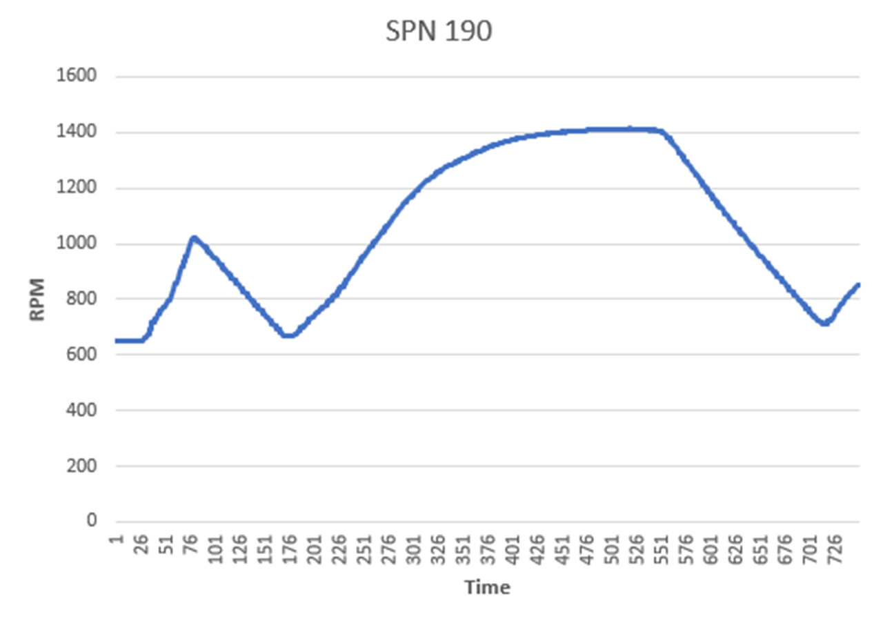
From this point on it’s just a matter of using the graphing functions in Excel to graph one column of data. The column you want to graph is the column you created with the concatenate (CONCAT) function and the hexadecimal to decimal (HEX2DEC) conversion function. You can select the entire column that was created in step 6 above, or just select a portion of it. Next select Insert from the menu bar to Insert Line or Area Chart, and this will give you a graph of the signal you’re interested in. A graph generated from a portion of my data is shown in Figure 9.

Picture7

Figure 9. Engine Speed as it appears in my data

I have labeled this graph SPN 190, and have done nothing else to it after creating it with the Insert Line or Area Cart Function. Spreadsheet programs have many powerful functions and ways of creation graphs, showing different signals in many different ways, and this procedure allows an engineer or technician to use these powerful features on most data captures on a CAN bus, provided they have a specification or .dbc file showing where that data is and how it is formatted.

This paper is meant to show a method of using non-specific software tools to help understand signals in a CAN data stream. Each step requires knowledge beyond what is explained here, but it is not the individual steps that are of interest. It is my hope that the general method, whether applied as in the example here, or using other software, will have value to readers who want to gain a more in-depth knowledge of CAN and how signals are transmitted using CAN.

Author Image

Bryan Hennessy

Bryan Hennessy is the Technical Partner Manager for Kvaser AB, with a background in J1939, CAN diagnostics, marine electronics, and semiconductors.

Debug on...